11.1 Matploatlib
1. 什么是Matploatlib
Matploatlib是Python的一个2D绘图库,它可以与Numpy一起使用,提供了一种有效的MatLab开源替代方案。Matploatlib试图让简单的事情更简单,让无法实现的事情变得可以实现,只需要几行代码就可以生成绘图。
2. 常见的图形及意义
折线图:以折现的上升或下降来表示统计数量的增减变化
特点:能够显示数据的变化趋势,反应失误的变化情况。
img1.png
散点图:用两组数据构成多个坐标点,考察坐标点的分布,判断两个变量之间是否存在某种关联或总结坐标点的分布模式
特点:判断变量之间是否存在数量变化趋势,展示离群点(分布规律)
img2.png
柱状图:排列在工作表的列或行中的数据可以绘制到柱状图中。
特点:绘制连离散的数据,能够一眼看出各个数据的大小,比较数据之间的差别。(统计/对比)
img3.png
直方图:由一系列高度不等的纵向条纹或线段表示数据分布的情况。 一般用横轴表示数据范围,纵轴表示分布情况。
特点:绘制连续性的数据展示一组或者多组数据的分布状况(统计)
img4.png
饼图:用于表示不同分类的占比情况,通过弧度大小来对比各种分类。
特点:分类数据的占比情况(占比)
img5.png
3. Matploatlib安装
使用清华源安装
pip3 install matplotlib -i https://pypi.tuna.tsinghua.edu.cn/simple
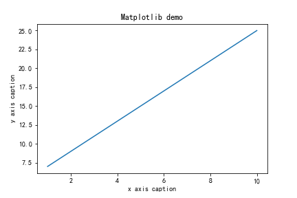
例子:
# 导入模块
import matplotlib.pyplot as plt
import numpy as np
# 在jupyter中执行的时候显示图片
%matplotlib inline
x = np.arange(1,11)
y =  2  * x +  5
plt.title("Matplotlib demo")
plt.xlabel("x axis caption")
plt.ylabel("y axis caption")
plt.plot(x,y)
plt.show()
img6.png
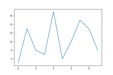
4. 折线图
4.1 折线图的绘制
from matplotlib import pyplot as plt
import random
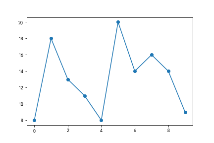
x = range(10) # x轴的位置
y = [random.randint(5, 20) for i in range(10)]
# 传入x和y, 通过plot画折线图
plt.plot(x,y)
plt.show()
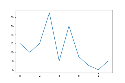
img7.png
4.2 折线图的颜色和形状设置
from matplotlib import pyplot as plt
import random
x = range(10) # x轴的位置
y = [random.randint(5, 20) for i in range(10)]
# 传入x和y, 通过plot画折线图
plt.plot(x, y, color='red',alpha=0.5,linestyle='--',linewidth=3)
plt.show()
'''

基础属性设置
color='red' : 折线的颜色
alpha=0.5 : 折线的透明度(0-1)
linestyle='--' : 折线的样式
linewidth=3 : 折线的宽度

线的样式
- 实线(solid)
-- 短线(dashed)
-. 短点相间线(dashdot)
: 虚点线(dotted)

'''
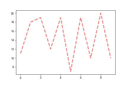
img8.png
4.3 折点样式
from matplotlib import pyplot as plt
import random
x = range(10) # x轴的位置
y = [random.randint(5, 20) for i in range(10)]
# 传入x和y, 通过plot画折线图
plt.plot(x, y, marker='o')
plt.savefig('1.png')

'''
折点形状选择:
================ ===============================
character description
================ ===============================
``'-'`` solid line style
``'--'`` dashed line style
``'-.'`` dash-dot line style
``':'`` dotted line style
``'.'`` point marker
``','`` pixel marker
``'o'`` circle marker
``'v'`` triangle_down marker
``'^'`` triangle_up marker
``'<'`` triangle_left marker
``'>'`` triangle_right marker
``'1'`` tri_down marker
``'2'`` tri_up marker
``'3'`` tri_left marker
``'4'`` tri_right marker
``'s'`` square marker
``'p'`` pentagon marker
``'*'`` star marker
``'h'`` hexagon1 marker
``'H'`` hexagon2 marker
``'+'`` plus marker
``'x'`` x marker
``'D'`` diamond marker
``'d'`` thin_diamond marker
``'|'`` vline marker
``'_'`` hline marker
'''
img9.png
4.4 图片大小和保存
from matplotlib import pyplot as plt
import random
x = range(2,26,2) # x轴的位置
y = [random.randint(15, 30) for i in x]
# 设置图片的大小
'''
figsize:指定figure的宽和高,单位为英寸;
dpi参数指定绘图对象的分辨率,即每英寸多少个像素,缺省值为80 1英寸等于2.5cm,A4纸是 21*30cm的纸张
'''
# 根据画布对象
plt.figure(figsize=(20,8),dpi=80)

plt.plot(x,y) # 传入x和y, 通过plot画图
# plt.show()
# 保存(注意: 要放在绘制的下面,并且plt.show()会释放figure资源,如果在显示图像之后保存图片将只能保存空图片。)
plt.savefig('1.png')
# 图片的格式也可以保存为svg这种矢量图格式,这种矢量图放在网页中放大后不会有锯齿
# plt.savefig('1.svg')
4.5 绘制X轴和Y轴刻度
from matplotlib import pyplot as plt
import random
x = range(2,26,2) # x轴的位置
y = [random.randint(15, 30) for i in x]
plt.figure(figsize=(20,8),dpi=80)
# 设置x轴的刻度范围
# plt.xticks(x)
# plt.xticks(range(1,25))
# 设置y轴的刻度
# plt.yticks(y)
# plt.yticks(range(min(y),max(y)+1))
# 构造x轴刻度标签
x_ticks_label = ["{}:00".format(i) for i in x]
#rotation = 45 让字旋转45度
plt.xticks(x,x_ticks_label,rotation = 45)
# 设置y轴的刻度标签
y_ticks_label = ["{}℃".format(i) for i in range(min(y),max(y)+1)]
plt.yticks(range(min(y),max(y)+1),y_ticks_label)
# 绘图
plt.plot(x,y)
plt.show()
img10.png
4.6 一图多线
import matplotlib.pyplot as plt
%matplotlib inline
plt.rcParams['font.sans-serif']=['SimHei']
plt.rcParams['axes.unicode_minus']=False

y1 = [random.randint(5, 20) for i in range(30)]
y2 = [random.randint(0, 50) for i in range(30)]

x = range(0,30)
# # 设置图形
plt.figure(figsize=(20,8),dpi=80)
'''
添加图例:label 对线的解释,然后用plt.legend添加到图片上;
添加颜色: color='red'
线条风格: linestyle='-'; - 实线 、 -- 虚线,破折线、 -. 点划线、 : 点虚线,虚线、 '' 留空或空格
线条粗细: linewidth = 5
透明度: alpha=0.5
'''
plt.plot(x,y1,color='red',label='股票A')
plt.plot(x,y2,color='blue',label='股票B')
# 设置x轴刻度
xtick_labels = ['{}日'.format(i+1) for i in x]
plt.xticks(x,xtick_labels,rotation=45)
# 绘制网格(网格也是可以设置线的样式)
#alpha=0.4 设置透明度
plt.grid(alpha=0.4)
# 添加图例(注意:只有在这里需要添加prop参数是显示中文,其他的都用fontproperties)
# 设置位置loc : upper left、 lower left、 center left、 upper center
plt.legend(loc='upper right')
#展示
plt.savefig('1.png')
img11.png
4.7 多坐标系子图
# add_subplot方法----给figure新增子图
import numpy as np
import matplotlib.pyplot as plt
x = np.arange(1, 100)
#新建figure对象
fig=plt.figure(figsize=(20,10),dpi=80)
#新建子图1
ax1=fig.add_subplot(2,2,1)
ax1.plot(x, x)
#新建子图2
ax3=fig.add_subplot(2,2,2)
ax3.plot(x, x ** 2)
ax3.grid(color='r', linestyle='--', linewidth=1,alpha=0.3)
#新建子图3
ax4=fig.add_subplot(2,2,3)
ax4.plot(x, np.log(x))
plt.show()

"""
#方法二:
import matplotlib.pyplot as plt
import numpy as np
x = np.arange(1, 100)
#划分子图
fig,axes=plt.subplots(2,2)
ax1=axes[0,0]
ax2=axes[0,1]
ax3=axes[1,0]
ax4=axes[1,1]
fig=plt.figure(figsize=(20,10),dpi=80)
#作图1
ax1.plot(x, x)
#作图2
ax2.plot(x, -x)
#作图3
ax3.plot(x, x ** 2)
# ax3.grid(color='r', linestyle='--', linewidth=1,alpha=0.3)
#作图4
ax4.plot(x, np.log(x))
plt.show()
"""
img12.png
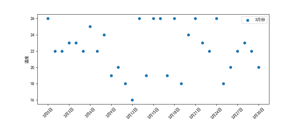
5. 散点图
import matplotlib.pyplot as plt
%matplotlib inline
plt.rcParams['font.sans-serif']=['SimHei']
plt.rcParams['axes.unicode_minus']=False

import random
x = range(31) # x轴的位置
y = [random.randint(15, 26) for i in range(31)]

# 设置图形大小
plt.figure(figsize=(20,8),dpi=100)
# 使用scatter绘制散点图
plt.scatter(x,y,label= '3月份')
# 调整x轴的刻度
_xticks_labels = ['3月{}日'.format(i) for i in x]
plt.xticks(x[::3],_xticks_labels[::3],rotation=45)
plt.xlabel('日期')
plt.ylabel('温度')
# 图例
plt.legend()
plt.show()
img2.png
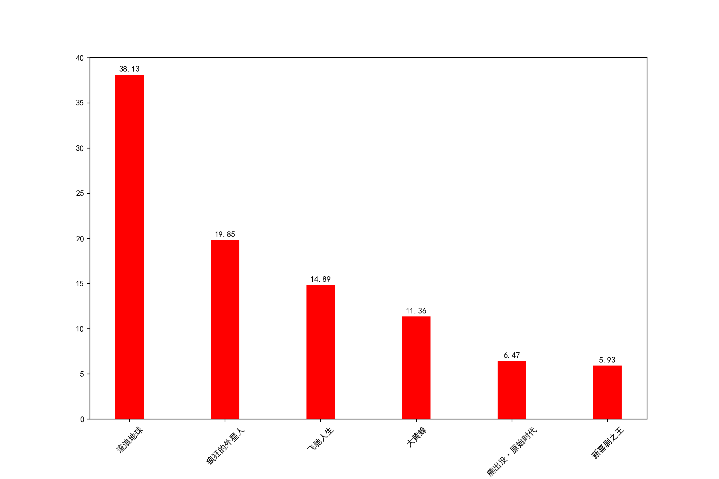
6.柱状图
import matplotlib.pyplot as plt
%matplotlib inline
plt.rcParams['font.sans-serif']=['SimHei']
plt.rcParams['axes.unicode_minus']=False

a = ['流浪地球','疯狂的外星人','飞驰人生','大黄蜂','熊出没·原始时代','新喜剧之王']
b = [38.13,19.85,14.89,11.36,6.47,5.93]
plt.figure(figsize=(10,4),dpi=100)

# 绘制条形图的方法
width=0.3 # 条形的宽度
rects = plt.bar(range(len(a)),b,width=0.3,color='r')
plt.xticks(range(len(a)),a,rotation=45)
# 在条形图上加标注(水平居中)
for rect in rects:
    height = rect.get_height()
    plt.text(rect.get_x() + rect.get_width() / 2, height+0.3, str(height),ha="center")
plt.savefig("1.png")
img3.png
7. 直方图
import matplotlib.pyplot as plt
%matplotlib inline
plt.rcParams['font.sans-serif']=['SimHei']
plt.rcParams['axes.unicode_minus']=False

time = [131, 98, 125, 131, 124, 139, 131, 117, 128, 108, 135, 138, 131, 102, 107, 114,
119, 128, 121, 142, 127, 130, 124, 101, 110, 116, 117, 110, 128, 128, 115, 99,
136, 126, 134, 95, 138, 117, 111,78, 132, 124, 113, 150, 110, 117, 86, 95, 144,
105, 126, 130,126, 130, 126, 116, 123, 106, 112, 138, 123, 86, 101, 99, 136,123,
117, 119, 105, 137, 123, 128, 125, 104, 109, 134, 125, 127,105, 120, 107, 129, 116,
108, 132, 103, 136, 118, 102, 120, 114,105, 115, 132, 145, 119, 121, 112, 139, 125,
138, 109, 132, 134,156, 106, 117, 127, 144, 139, 139, 119, 140, 83, 110, 102,123,
107, 143, 115, 136, 118, 139, 123, 112, 118, 125, 109, 119, 133,112, 114, 122, 109,
106, 123, 116, 131, 127, 115, 118, 112, 135,115, 146, 137, 116, 103, 144, 83, 123,
111, 110, 111, 100, 154,136, 100, 118, 119, 133, 134, 106, 129, 126, 110, 111, 109,
141,120, 117, 106, 149, 122, 122, 110, 118, 127, 121, 114, 125, 126,114, 140, 103,
130, 141, 117, 106, 114, 121, 114, 133, 137, 92,121, 112, 146, 97, 137, 105, 98,
117, 112, 81, 97, 139, 113,134, 106, 144, 110, 137, 137, 111, 104, 117, 100, 111,
101, 110,105, 129, 137, 112, 120, 113, 133, 112, 83, 94, 146, 133, 101,131, 116,
111, 84, 137, 115, 122, 106, 144, 109, 123, 116, 111,111, 133, 150]
# 2)创建画布
plt.figure(figsize=(20, 8), dpi=100)
# 3)绘制直方图
# 设置组距
distance = 2
# 计算组数
group_num = int((max(time) - min(time)) / distance)
# 绘制直方图
plt.hist(time, bins=group_num)
# 修改x轴刻度显示
plt.xticks(range(min(time), max(time))[::2])
# 添加网格显示
plt.grid(linestyle="--", alpha=0.5)
# 添加x, y轴描述信息
plt.xlabel("电影时长大小")
plt.ylabel("电影的数据量")
# 4)显示图像
plt.show()
img4.png
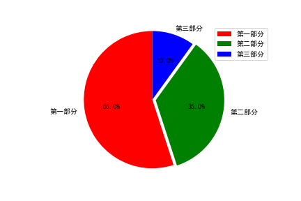
8. 饼图
import matplotlib.pyplot as plt
%matplotlib inline
plt.rcParams['font.sans-serif']=['SimHei']
plt.rcParams['axes.unicode_minus']=False

label_list = ["第一部分", "第二部分", "第三部分"] # 各部分标签
size = [55, 35, 10] # 各部分大小
color = ["red", "green", "blue"] # 各部分颜色
explode = [0, 0.05, 0] # 各部分突出值
"""
绘制饼图
explode:设置各部分突出
label:设置各部分标签
labeldistance:设置标签文本距圆心位置,1.1表示1.1倍半径
autopct:设置圆里面文本
shadow:设置是否有阴影
startangle:起始角度,默认从0开始逆时针转
pctdistance:设置圆内文本距圆心距离
返回值
l_text:圆内部文本,matplotlib.text.Text object
kaikeba.com开课吧
精选领域名师,只为人才赋能 13
###
p_text:圆外部文本
"""
patches, l_text, p_text = plt.pie(size,
explode=explode,
colors=color,
labels=label_list,
labeldistance=1.1,
autopct="%1.1f%%",
shadow=False,
startangle=90,
pctdistance=0.6)
plt.axis("equal") # 设置横轴和纵轴大小相等,这样饼才是圆的
plt.legend()
plt.show()
img5.png